|
 |
|
|
|
| Thread title: Nixism's New Logos.. |
 |
|
|
| |
|
 Thread tools
 Search this thread
 Display Modes
|
|
|
09-07-2007, 07:48 PM
|
#1
|
Status: Nixism
Join date: Aug 2006
Location: Nix Yorkism
Expertise:
Software:
Posts: 2,147

|
 Nixism's New Logos.. Nixism's New Logos..
The amazing Gonzalo just created logos for nixism, and I would like some feedback.
Look in my avatar, I have 2 versions of it.. Please let me know what you think..
Which do you prefer and why? Open to all comments and suggestions..
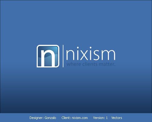
1a.
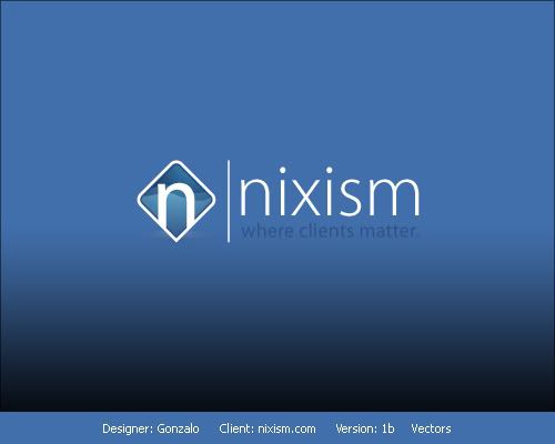
1b.
|
|
|
|
09-07-2007, 07:54 PM
|
#2
|
Status: I Code Things
Join date: Aug 2005
Location: UK
Expertise:
Software:
Posts: 1,998

|
|
|
|
|
09-07-2007, 07:59 PM
|
#3
|
Status: Ruby on Rails Developer
Join date: Oct 2004
Location: England, UK
Expertise: Ruby, Rails, jQuery
Software: Chocolat, Sublime Text 3
Posts: 2,343

|
2nd, no real reason but it doesn't look like something you see everyday. Its not all straight and boring, it has something different to it. Nice logo, very brandable.
|
|
|
|
09-07-2007, 08:00 PM
|
#4
|
Status: design rockstar
Join date: Jan 2005
Location: guelph, ontario
Expertise:
Software:
Posts: 2,246
|
what is nixism and what does it do?
dark blue on medium blue? srsly?
|
|
|
|
09-07-2007, 08:00 PM
|
#5
|
Status: A legend among men
Join date: Aug 2005
Location: Germantown, Maryland
Expertise:
Software:
Posts: 2,529

|
I like the first one 
|
|
|
|
09-07-2007, 08:01 PM
|
#6
|
Status: I Code Things
Join date: Aug 2005
Location: UK
Expertise:
Software:
Posts: 1,998
|
Ye i think i'd prefer the second if it was the same size as the 2nd. But otherwise they are awesome and Gonzalo's done an awesome job.
|
|
|
|
09-07-2007, 08:01 PM
|
#7
|
Status: design rockstar
Join date: Jan 2005
Location: guelph, ontario
Expertise:
Software:
Posts: 2,246
|
also, how many concepts were there? if the only one you got was putting an n in a sqaure, i'd have to say it's a weak logo.
|
|
|
|
09-07-2007, 08:01 PM
|
#8
|
Status: Nixism
Join date: Aug 2006
Location: Nix Yorkism
Expertise:
Software:
Posts: 2,147
|
Originally Posted by derek lapp 
what is nixism and what does it do?
dark blue on medium blue? srsly?
|
Nixism Web Hosting
Colors flow with the design, if you don't like the design then I guess you wont like the logos 
|
|
|
|
09-07-2007, 08:02 PM
|
#9
|
Status: Nixism
Join date: Aug 2006
Location: Nix Yorkism
Expertise:
Software:
Posts: 2,147
|
Originally Posted by derek lapp
also, how many concepts were there? if the only one you got was putting an n in a sqaure, i'd have to say it's a weak logo.
|
He gave me 10-12 concepts, but these are the two my partner and I liked.. I also had a 3rd one I liked, if you want to see it..  Sorry for double post..
|
|
|
|
09-07-2007, 08:03 PM
|
#10
|
Status: design rockstar
Join date: Jan 2005
Location: guelph, ontario
Expertise:
Software:
Posts: 2,246
|
for real? you can't justify putting dark blue text on dark blue backgrounds because it matches the design. that's just a design faux pas. the tagline should be white too so i can read it without squinting.
edit: it's more of i don't understand what's behind it. i know n for nixism, but a lot of people do that. don't get me wrong, it's not ugly, but i have a real appreciation for solid branding. when i look at it and think 'oh, that's clever'. as such, i have a distaste for weaker ideas as it's less brandable when it's something any company can do.
edit2: a lot of people confuse my logo with just a v in a circle, but it's actually a root symbol. the resemblance to v was just coincidence. i've actually found like 4 things it could represent other than a v.
|
|
|
|
|
|
|
|
|
|
Currently Active Users Viewing This Thread: 1 (0 members and 1 guests)
|
|
|
| Thread Tools |
|
|
| Display Modes |
 Linear Mode Linear Mode
|
|
|


 Forum Contains New Posts
  Forum Contains No New Posts
  Forum is Closed